Staples' The HUB Redesign

Staples' The HUB Redesign

Project type

Redesign and Launch

Redesign and Launch

Company

Staples

Staples

Location

USA

USA

Industry

Retail

Retail

Role

Lead Designer

Lead Designer

Timeline

3-6 months

3-6 months

Brief

Brief

The HUB is a highly used resource amongst associates and managers alike but was due for some design love. We were asked by leadership to partner with HR and our internal comms teams to do generative research to identify the biggest pain points and come up with designs to help remediate those issues across multiple phases with the goals of:

  1. Reducing calls to support

  2. Increasing findability and user confidence

  3. Making search match best-in-class web experiences

Why so many rage clicks?!

Why so many rage clicks?!

1. Search either didn't work or when it did it wasn't as expected
2. Multiple logins between various areas of the site caused a lot of friction and frustration for users
3. Due to poor search function users are forced to navigate the application and often feel "overwhelmed" or "confused"
4. Users noted that the dashboard was “cluttered”, “too much”, and “overwhelming”
5. Users expected The Hub’s dashboard to show information based on their location and business unit

Where do we start?

Competitive Analysis

Competitive Analysis

We took time to look at other competitors in the intranet space to make sure our redesigns would align with common mental models and design patterns used elsewhere. We also took of common features as well as potential UX or design failings we could improve upon.

We took time to look at other competitors in the intranet space to make sure our redesigns would align with common mental models and design patterns used elsewhere. We also took of common features as well as potential UX or design failings we could improve upon.

User Research

User Research

We performed generative research to define user pain points using 1:1 live remote user interviews. This research was conducted with 26 participants that represented various roles and types of users.


We performed generative research to define user pain points using 1:1 live remote user interviews. This research was conducted with 26 participants that represented various roles and types of users.


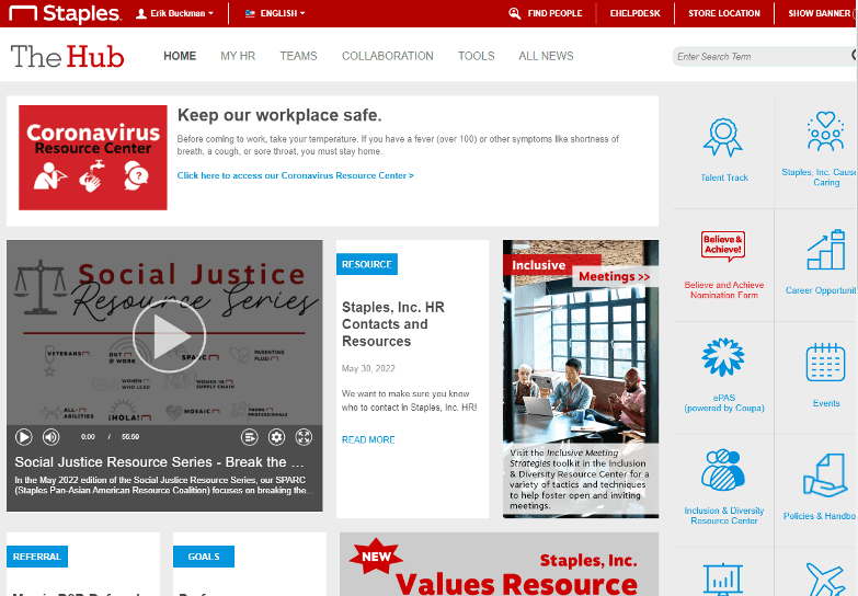
The Hub’s home page is “cluttered,” “too much,” and “overwhelming”

RECOMMENDATIONS

- Consider an audit of the most visited policies/documents and make them readily available
- Use IA analysis to define the content the associate needs then focus on wants

Navigation

The navigation is overwhelming and confusing but I have to use it because search doesn't really work.

V. Schenk

Sales Associate

Homepage

I pretty much ignore everything on this page and just use a couple of shortcuts because everything is outdated and rarely applies to me.

M. Hewson

Director of Customer Service

Lack of personalization

The Hub seems overly focused on HQ. I want to see information that's personalized to me and more specific to my location and/or department.

S. Fischer

Remote Manager

Homepage

There's always so much content on the homepage but a lot is outdated. Sometimes I just want to find to watch the recording of the last all hands and can't.

C. Barry

Senior Marketing Designer

Search

I find The HUB generally confusing and hard to navigate so I use Search but it usually doesn't work the way I expect or results I get are not current and I just end up contacting support or have my manager find what I was looking for.

R. Brewer

Lead Designer

The search experience was the most cited pain point due to duplicated results, outdated content, and incomplete results.

RECOMMENDATIONS

- Meet user expectations by modeling after best-in-class services like Google
- Search results should reflect who created the document, policy, or information
- Regularly analyze and cleanse information available to users to get rid of old, duplicate, or inaccurate resources

Navigation

The navigation is really confusing. There's almost 3 separate menus and I only click on one or two things most of the time. Some things don't even work or I don't even know what they are.

E. Graves

Retail Associate

What did we learn?

Redesign Homepage and Nav

The overall feelings from users is that navigation and the home page are cluttered, confusing, and overwhelming leading to lack engagement and excessive support calls.

Fix Search

How Search worked simply didn't match users' expectations. We need to make this match current best-in-class experiences and do a full content audit to remove stale information from our help articles and resources.

Personalize the HUB experience for users

Users expect the experience to be more personalized and see information on their home page, and other pages, be customized to their role, location, and business unit. Users want to log in and see relevant information as soon as possible.

Early FigJam Collaboration with UX, Product, and Engineering
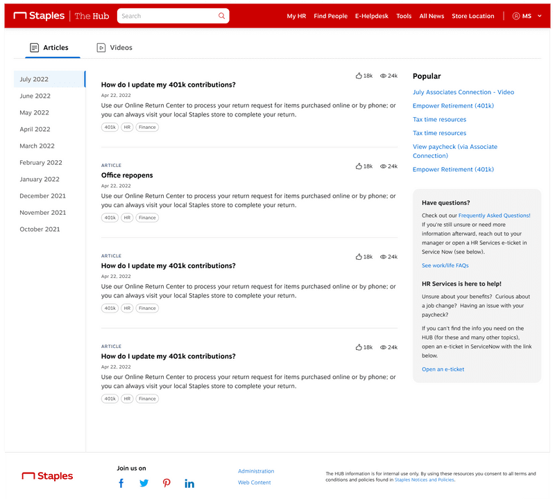
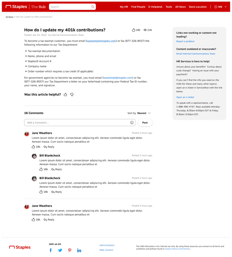
I started a FigJam file based on research takeaways. I wanted to start with something low-fi to encourage stakeholder collaboration through commenting or low-fi design ideation.

Some user feedback you'll see represented are having content personalized and customizable, shortcuts for most used areas of the portal, surfacing latest and most important information at the top, reducing clutter in the navigation, and more.

Before and After

Before and After

Hover and use the slider to compare the legacy state vs the redesign.

Hover and use the slider to compare the legacy state vs the redesign.

Final Screens

Some highlights are: improved affordances throughout, a cleaner and simpler bottom nav, better charting and data visualizations, top KPIs more clearly called out, and the ability to chat with your coach from any screen.

Some highlights are: improved affordances throughout, a cleaner and simpler bottom nav, better charting and data visualizations, top KPIs more clearly called out, and the ability to chat with your coach from any screen.

Measuring and Validating Designs

Measuring and Validating Designs

Research Feedback

Research Feedback

We conducted unmoderated research using UserTesting.com with a subset of our previous participants in the generative research study.

Homepage highlights:
- Overall feedback was positive with words like "simple", "clean", and "easy to use" used ​
- New shortcuts section was well received and users liked the customizability
- Don't rename any of the shortcuts as it's confusing

Search highlights:
- Add being able to filter by category​
- Was positively received as much more usable but also technically more functional

Results and Reflection

Results and Reflection

This project was difficult to lead at times as there were product owners who didn't know what they really wanted and hadn't led a project like this before. This required patience and a fair amount of leadership on my part as UX to help guide and shape the requirements and goals of the project as it progressed.

Site traffic: Increased by +35%

Use of search decreased by over 40% because the site was that much easier to navigate

Was selected out of over 600 nominees to receive an award for our work and impact

I LOVE the new look on the HUB. I'm very excited and wanted to share how much more user friendly it is!

I LOVE the new look on the HUB. I'm very excited and wanted to share how much more user friendly it is!

User quote

HR can be difficult to work with sometimes and we didn't always have a clear vision initially. You were able to help curate best practices and create example vision ideas that were instrumental to us helping get this new vision together.

HR can be difficult to work with sometimes and we didn't always have a clear vision initially. You were able to help curate best practices and create example vision ideas that were instrumental to us helping get this new vision together.

Feedback from HR stakeholder

Without your work, we would have been extremely lost! As far as I'm concerned, that page should have your signature on it with pride when we are done.

Without your work, we would have been extremely lost! As far as I'm concerned, that page should have your signature on it with pride when we are done.

Feedback from my manager

Check out another case study

Eat to Perform

A fitness and wellness mobile app with a passionate monthly user base of 5,000+

A fitness and wellness mobile app with a passionate monthly user base of 5,000+

Cheetah Digital Marketing Suite (Coming Soon)

A 0-1 vision project to rethink how marketers use Cheetah Digital's suite of tools.

A 0-1 vision project to rethink how marketers use Cheetah Digital's suite of tools.

Salesforce Email Creation Flow (Coming Soon)

Redesigned from the ground up Marketing Cloud's email creation workflow used by 10,000+ users every day.

Redesigned from the ground up Marketing Cloud's email creation workflow used by 10,000+ users every day.

Phil Schroeder // Copyright © 2024

Phil Schroeder // Copyright © 2024