
Unifying three enterprise marketing products through a scalable design system
Following two acquisitions, Cheetah Digital's platform consisted of multiple products with distinct visual languages, component structures, and workflows.
I led a design system initiative to audit these experiences, identify fragmentation, and define a unified foundation spanning tokens, layout primitives, and reusable components.
The result was a scalable system architecture that supported platform consolidation while enabling teams to build new features consistently across products.
Impact
What drove our strategy...
Platform Context
Cheetah Digital expanded its enterprise marketing platform through two acquisitions, adding capabilities across messaging, loyalty, and customer engagement.
Each product had evolved independently, bringing different design languages, navigation models, and UI patterns. As these tools began operating under one platform, the inconsistencies became increasingly visible.
Product Fragmentation
The three applications lacked a shared design foundation.
Key issues included:
- inconsistent typography, colors, and UI components
- different navigation and interaction patterns
- duplicated components with conflicting behaviors
- workflows that varied across modules
This fragmentation increased cognitive load for marketers and slowed product teams building new features.
System Objective
We needed a scalable design system that could unify the platform while supporting long-term product development.
This meant:
- reconciling three existing design approaches
- evaluating the maturity of each system
- balancing engineering feasibility and adoption
- defining shared foundations for future work
Understanding the platform
Platform Audit
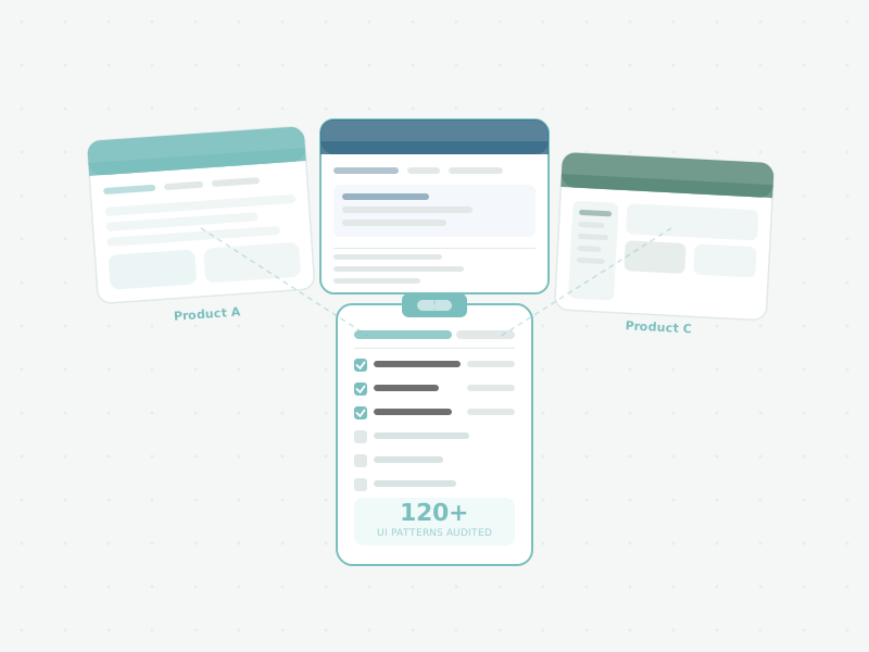
We started with a full UI audit across three applications that were being brought under one platform. I partnered with 1-2 design contractors to catalog patterns across layouts, components, typography, color, and key workflows. The goal was to identify where experiences overlapped, where they diverged, and which product areas were mature enough to serve as a foundation.
Information Architecture
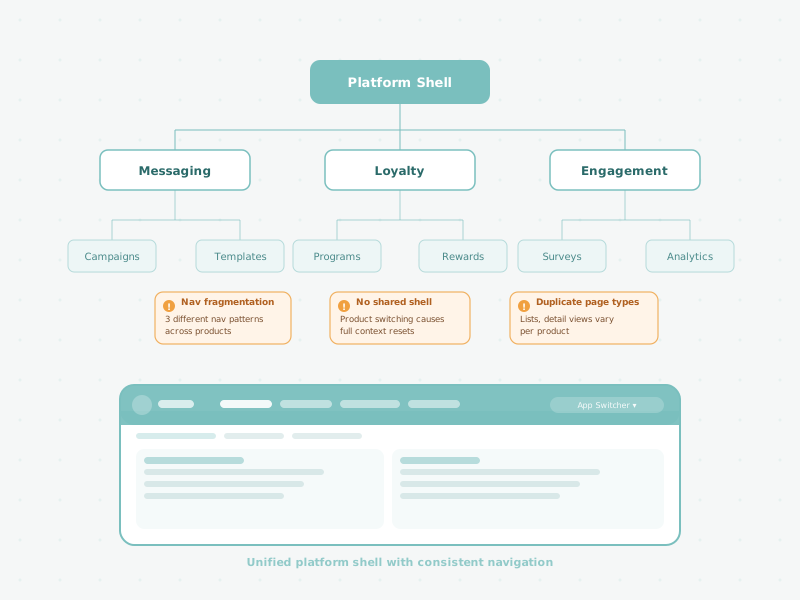
Before components, we needed a shared structure. We mapped how marketers moved across modules and where navigation patterns broke down between products. This helped us define a cohesive platform shell, establish consistent page types, and reduce the cognitive load of switching tools inside a single suite.
Foundations
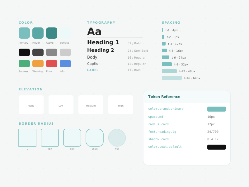
Next we aligned the basics that everything else depends on. We standardized core tokens like color, typography, spacing, and elevation so the three apps could begin converging without waiting on full rewrites. This also created a clear contract for engineering and a stable baseline for future component work.
Component System
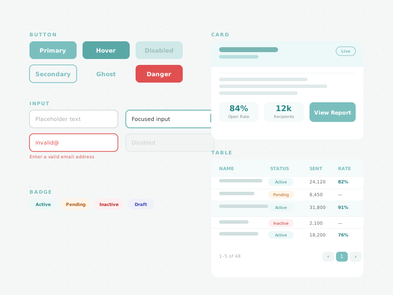
With foundations in place, I designed a unified component library that could scale across products and teams. We defined consistent anatomy, states, and accessibility expectations, then prioritized components that appeared most often in high-traffic workflows. The focus was practical adoption: patterns that engineering could implement incrementally while still moving toward a single design language.
Adoption and Rollout
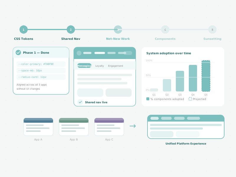
We treated rollout as a phased program, not a single release. Phase 1 aligned CSS values across apps, then phase 2 introduced a shared header and app switcher to make the suite feel cohesive. From there, we targeted net-new work and high-value workflows, while allowing deprecated areas to sunset rather than forcing costly retrofits.
What did we
learn?
Adoption beats perfection
A design system only works if teams can use it. The biggest wins came from shipping a clear baseline and making it easy for engineering to adopt in phases, rather than waiting for an ideal end state.
Unification is a sequencing problem
Bringing three products under one umbrella required a deliberate order of operations. Aligning tokens and navigation first created visible cohesion quickly, then component-level convergence could follow with less friction.
Constraints define the strategy
Acquisitions, legacy UI, and resourcing realities shaped what was feasible. The system succeeded when it acknowledged those constraints and provided a practical path from "inconsistent today" to "cohesive over time."
Unified Platform Vision
The audit revealed that the platform's biggest challenge was not individual screens. It was the lack of a shared system across products, so I designed a scalable design system built around three layers: foundations, layout primitives, and components. These layers created a flexible system that unified the platform's visual language while giving product teams a practical path toward long-term consistency.
Foundations
The foundation layer established shared design tokens including color, typography, spacing, and iconography.
Aligning these values across products became the first step toward visual consistency and allowed engineering teams to converge without major interface rewrites.
Layout Primitives
We defined standardized layout structures that governed page composition, spacing, and hierarchy.
These primitives created a consistent structural language across the platform while still allowing product teams flexibility within individual modules.
Components
On top of these foundations, I built a reusable component library covering navigation patterns, form inputs, feedback states, and data presentation.
These components enabled teams to assemble complex interfaces from consistent building blocks rather than reinventing patterns across products.

Phased Alignment
Rolling out the system across three enterprise products required a phased adoption strategy. Rather than attempting a full redesign, we focused on introducing alignment in stages that engineering teams could realistically implement.
Foundations
The first phase aligned foundational tokens including colors, typography, and spacing across all three applications.
This created immediate visual consistency while requiring minimal engineering effort, allowing teams to converge on a shared baseline without large interface changes.
Platform Navigation
Next we introduced a unified global navigation shell, including a shared header and application switcher.
This allowed users to move between tools within the suite seamlessly and significantly improved the perception of a cohesive platform experience.
System Adoption
With the platform shell in place, the design system began driving deeper alignment across components, layouts, and interaction patterns.
Rather than forcing a full migration, the system was applied to new development first while existing surfaces were gradually updated or sunset.
Results and Reflection
This initiative established the foundation for a unified design system across Cheetah Digital's marketing platform. By auditing three independent products and defining a shared set of tokens, layout primitives, and reusable components, we created a scalable framework that enabled teams to build more consistently across the suite. Early rollout phases aligned foundational styling and introduced a shared navigation shell, giving the platform a more cohesive experience while deeper system adoption continued.
Beyond the interface improvements, the project reinforced that successful design systems are as much organizational initiatives as they are design artifacts. Unifying multiple products required balancing ideal system architecture with real-world constraints such as legacy interfaces, engineering capacity, and product roadmaps. By prioritizing incremental adoption and shared foundations first, the system created a practical path toward long-term platform alignment.


